Arrive
A New Day for Urban Mobility
Transportation & Logistics
Project information
Arrive is the new parent brand of a growing ecosystem of smart mobility solutions, including EasyPark, Flowbird, Parkopedia, RingGo, ParkMobile, and others. Together, they are present in over 20,000 cities and 90 countries with one shared mission: to make cities more livable by making movement through them smarter, simpler, and more human.
As it evolves beyond parking to offer a multitude of services such as integrated tools for traffic management, mobility data, smart payments, and reinvestment into public transport and green spaces, it needed a new name and identity that embodies not just transactional functionality, but a more emotional, human-centric experience of travel.
The new brand revolves around the central brand idea of ‘Positive Urban Energy’ — crafted to express uplifting optimism for the future of mobility; endeavouring not just to show things as they currently are, but how they could be when city journeys are made easier through smart urban planning and technology.
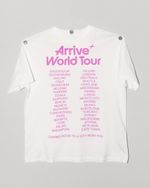
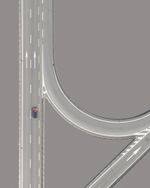
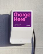
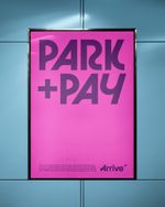
Every asset has been intentionally crafted to feel light and weightless: photography with open, airy compositions and clear skies; pastel pink, purple and cyan gradients that are inspired by the colours of perfect sunrises and sunsets; and a symbol that takes the form of an ethereal north star. Anchored by an adventurous bespoke typeface that reflects the flow and geometry of city roads in a highly graphic way, the visual identity aims to evoke the feeling of a perfect day’s commute through the city — smooth, effortless and worry-free.
All of this comes together to form a unified identity for a complex global platform that feels as clear, optimistic and seamless as the journeys it enables; providing an intuitive visual language that can seamlessly be applied to anything from ATL advertising campaigns to scalable digital touchpoints. Just as importantly, this is a brand that isn’t afraid to zag when others zig, to visually stand out against ever-converging tech tropes as it seeks to make cities more livable.
Note: Brand imagery created by Generative A.I. (particularly for scenes that don’t exist in real life) is always subject to rounds of manual photo-retouching to attain a suitable level of quality. They are also supplemented by images sourced from existing stock libraries to ensure accuracy of geographical details and locales.
Client quote
”Mobility is about more than getting from A to B, it’s about how we design, interact with, and ultimately experience cities. Arrive is the platform for that future.” — Cameron Clayton, CEO at Arrive “Bold has successfully created an identity that captures both the scale of our global ambition and the simplicity we strive for. Arrive is more than a brand – it’s a symbol of a new era in urban mobility, one that connects, moves, and reflects everything we stand for.” — Scott Booker, General Manager Parking at Arrive
Services
Brand Strategy Brand Story Brand Naming Concept Development Brand Asset Development Design System Custom Typeface Design Digital Design System Motion Identity Brand Activation Design Implementation Brand Guidelines
Project partners
Typeface: OTT Foundry Image retouching: Parsley Studio Brand launch film: Paul Jerndahl, Giants and Toys
Background
A light and weightless identity for Arrive, the world’s leading global mobility platform. Designed to express boundless optimism for the future of urban mobility, the brand seeks to evoke the indescribable feeling of a perfect day’s commute through the city — bright, smooth and easy.


With Arrive, we are building the world's leading global mobility platform, supported by a brand identity that reflects our optimism for the future and our dedication to shape more livable cities around the world together


Bold has successfully created an identity that captures both the scale of our global ambition and the simplicity we strive for.