C More
Humanising the face of entertainment & film
Project summary
Faucibus id porta viverra augue id augue pellentesque sit. Tortor viverra tincidunt placerat aenean dapibus interdum. Laoreet leo in consectetur sit ac tristique. Commodo ac id massa egestas.
Dynamic and playful
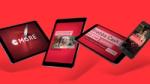
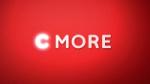
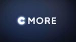
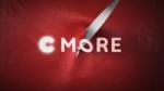
C More needed to stand out from a competitive international market by being passionate, local and personal. A bold and flexible identity was necessary to build brand recognition. A clearer visual tie to TV4 could be made by sharing visual elements such as the custom-made typeface Quattro the emoji-rich icon set and their famous colour red. The layout system draws inspiration from one of the most common digital interactions in people’s lives, online messaging. This connotation is further established through the chatty tone of voice, the friendly custom-made typeface and the emoji-rich icon set. The logotype with its glowing C reflects the world of film, the light in the cinema darkness with shadows and three dimensional effects. It’s dynamic and playful – adapting to different genres by taking part in the entertainment.
The new logotype with its glowing C reflects the world of film, the light in the cinema darkness with shadows and three dimensional effects. It is dynamic and playful – adapting to different genres by taking part in the entertainment.
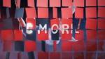
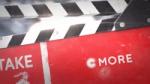
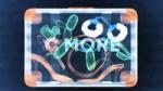
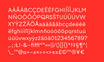

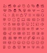
A comprehensive set of functional and emotional picograms and emojis were created, drawn to complement the custom-made typeface Quattro Sans. The tone of voice is chatty and informal, building on the concept of providing a human touch in a digital world. The custom-made typeface and iconography is combined to further establish the visual ties to the language of messaging.
Epidemic Sound × SXSW
A Sound for Every Story
Media & Entertainment
Brand Activation