PostNord
Delivering your world to you

Project summary
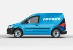
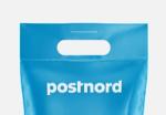
A warm and personal brand identity for the leading supplier of logistics solutions in the Nordic region, building on the idea of being the link between people and the things they care about.
Impact achieved
+95%
Sender ID
+54%
Preference
+72%
Brand liking
+71%
Brand trust
+21%
Brand consideration
Our new graphic device “The Link” derives from the wordmark that reflects PostNord’s role as the connection between people and the things they care about, constantly on the move towards delivering their needs, expectations and dreams to them. It’s the DNA of our new design language.


“Our new brand identity illustrates how our value is based on being the link between consumers and everything they care about. A strong and smart identity that, just like our brand, is dynamic and in constant motion.”


SCA
The force of the forest
Technology & Innovation
Brand Strategy, Brand Design, Digital Experience, +4