Proud member of the  NoA Family

Pressbyrån

Pushing a giant retailer to become more colourful

Some results since launch:
– Brand preference increased with 222%
– Almost double revenue results compared to rest of market

Pressbyrån with its more than 300 convenience stores around the country sought to become more emotional and inspiring. This was an exciting assignment as we also saw it as an opportunity to put some joy and colour on the streets of Sweden. Said and done. The scope included both interior design and packaging.

Our brief was to create a new packaging design for Pressbyrån’s range of consumable products that could create unity as well as highlight different categories. Due to the fact that Pressbyrån produce such large volumes of material we saw the project as an opportunity to put some joy and colour on the streets of Sweden!

Together with the Belgian illustrator Tim Colmant we created a series of playful and colourful illustrations inspired by Pressbyrån’s products. The illustrations can be used separately or together to create a pattern. We chose a hand-drawn illustration style that harmonised well with Pressbyrån’s typeface and visual identity and we arranged the producs in different suitable combinations, for example a coffee cup with a cinnamon roll and a soft drink with a stack of magazines. We worked with a unifying colour palette with Pressbyrån yellow as the primary colour. To achieve an even more playful and friendly feeling we integrated Pressbyrån’s tone-of-voice in the form of short, relevant messages across the entire range.

Together with our friends at StudioNoc we also designed Pressbyråns new interior design concept.

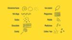
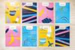
The design is based on abstract illustrations inspired by Pressbyråns product range.

We saw this project as an opportunity to put some joy and color on the streets of Sweden. Said and done.

Related Projects

Pontus In The Air Luxury and humour at Sweden’s largest airport
Video Poster Image
N!CK's Transforming an underdog into a household brand
Video Poster Image