SAS
Redefining an icon
Travel & Hospitality
Project information
SAS is the leading airline in Scandinavia and one of its strongest and most recognized brands. As their global brand agency for more than a decade, our collaboration has covered everything from strategy and positioning to brand design, fleet livery, uniforms, packaging design, digital experiences, and much more.
The first transformation (2014)
Back in 2014, SAS had become visually indistinguishable from their low price competitors. By focusing on data-driven insights, we targeted frequent travelers—just 12% of the market but responsible for 70% of SAS’s revenue. Named The True Travelers, this group was key to boosting willingness to pay. We elevated SAS’s brand to be more premium, aspirational, and digitally relevant, resulting in a transformed identity that resonated with the target group.
The second transformation (2022)
With the goal to create a stronger emotional connection between SAS and their travelers, in 2022 we developed an updated brand strategy, story and brand identity that signals quality, care and warmth, while preserving a strong recognition to the brand’s iconic design heritage. In addition to visual elements such as a new bespoke serif font, colors and layout system, we have also developed new concepts for motion and tone of voice.
Livery Design
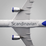
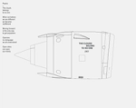
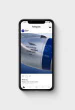
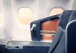
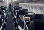
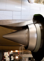
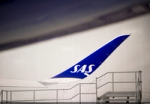
The new fleet livery redefines the SAS brand with a modern Scandinavian design. Featuring a cooler gray fuselage, lighter coating for reduced emissions, and prominent blue accents, the design embodies sophistication and pride. Updated interiors enhance the Scandinavian travel experience, blending comfort and modernity. Every line drawn and color chosen is made to feel like home for us, and like Scandinavia to the rest of the world. An icon, redefined.
Packaging design
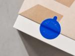
The New Nordic by SAS cube reduces plastic waste, saving up to 51 tons annually, and minimizes carbon impact through lightweight design. Inspired by the SAS wordmark, the packaging uses natural craft paper with embossed details and graphic elements to highlight dishes and emphasize seasonal, locally sourced ingredients.
Impact 2014-2015
+€167M Brand value +€65M Revenue +26% Willingness to pay X4 Return of media Investment In one year!
Impact 2022-2023
+42% Revenue +61% Brand Preference +21% Brand Consideration +67% Reliable +34% Inspiring traveling +28%Including and welcoming
Services
Brand Strategy & Positioning Target group analysis Vision and Mission Statements Concept Development Brand Asset Development Design System Custom Typeface Design Tone of Voice & Messaging Motion Identity Audio Identity Livery Design Packaging Design Uniform Design UX & UI Design Website & Mobile Design Campaign Design Brand Films Branded Environments Brand Guidelines
Project partners
Letters of Sweden Åkestam Holst
Project summary
For over a decade, we’ve had the privilege of partnering closely with Scandinavian Airlines as their global brand agency, shaping everything from strategy and positioning to brand design, fleet livery, uniforms, packaging, and digital experiences.
"Bold has successfully managed to create an identity that unites the entire SAS brand on all platforms and in every channel. Something we have been working towards for a long time."
Impact 2014-2015
- From loss in 2014, to €140M profit in 2015 - Willingness to pay + 26% - Brand value + €167 Million - Return of media Investment x 4 - Revenue +€65 Million - In one year!
Impact 2022-2023
- Revenue +42% - Brand Preference +61% - Brand Consideration +21% - Reliable +67% - Inspiring travelling +34% - Including and welcoming +28%


“I could not be more happy with the redefined brand identity that Bold has created for Scandinavian Airlines. Their dedicated, strategic and creative team has created an outstanding transformation that truly embodies our new position and continued journey forward."
Fleet livery
The first new SAS aircraft livery design in over 20 years is a sleek and elegant upgrade maximizing brand awareness in a proud yet sophisticated way.


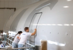
A new coating material requiring fewer layers of paint was used, reducing the weight of the aircraft and reducing climate impact. The interior and exterior of the fleet has been harmonized, tailored to the Scandinavian way of travel.

"The new livery design is a symbol of our future, a more sustainable and competitive future for SAS, but one that also embraces our heritage."


"The SAS livery is one of Scandinavia’s most important brand icons. The new design reflects our overall brand identity and a harmonization of our entire product design expression."




New Nordic by SAS
A sustainable food packaging solution minimizing waste and saving up to 51 tons of plastic per year. The lightweight packaging also lessens carbon impact - a contributor to more sustainable travel.




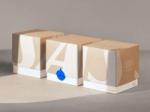
The New Nordic by SAS Cube, with locally sourced and seasonal ingredients, saves up to 51 tons of plastic per year by using organic plant-based plastic material.