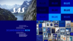
SAS
Journeys that matter
Project summary
Faucibus id porta viverra augue id augue pellentesque sit. Tortor viverra tincidunt placerat aenean dapibus interdum. Laoreet leo in consectetur sit ac tristique. Commodo ac id massa egestas.
The new Scandinavian Airlines
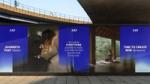
We are proud to reveal the new brand identity for Scandinavian Airlines, the leading airline in Scandinavia. With the goal to create a stronger emotional connection between SAS and their travelers we developed a new brand strategy, story and brand identity that signals quality, care and warmth, while preserving a strong recognition to the brand’s iconic design heritage.
We focus our messaging towards the emotional values of traveling, rather than the functional. Creating a warm and inspiring tone of voice with an aspirational feeling.
“I could not be more happy with the redefined brand identity that Bold has created for Scandinavian Airlines. Their dedicated, strategic and creative team has created an outstanding transformation that truly embodies our new position and continued journey forward. Our common goal has been to create a stronger emotional connection between SAS and our customers. An identity that signals quality, care and warmth.”


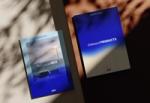
Developed secondary typeface
Together with the foundry Letters of Sweden we’ve developed a secondary bespoke typeface to complement our primary typeface Scandinavian New. The serif is built on the same proportions as the primary, and takes inspiration from the contrast and soft edges in the logo. Together they create a dynamic combination with the possibility to highlight, inspire and amplify.
Revisited and optimized for the future. In 2014 we did our first rebrand of Scandinavian Airlines. We are very proud of our ongoing, ten-year, collaboration with SAS and that we have once again been trusted to renew their brand.
Epidemic Sound × SXSW
A Sound for Every Story
Media & Entertainment
Brand Activation