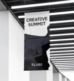
T:LABS
Remixing a brand
Project summary
Faucibus id porta viverra augue id augue pellentesque sit. Tortor viverra tincidunt placerat aenean dapibus interdum. Laoreet leo in consectetur sit ac tristique. Commodo ac id massa egestas.
T: Labs is an innovation hub within Swedish tech company Transcom, where ideas are captured and explored through a structured process for experimentation. Our task was to create a visual identity that was relatable, yet distinct from the mother brand.
Transcom’s visual identity is based on four graphic elements: Dots, rectangle, line and circle. The starting point for T:LABS new identity was creating a tool in which participants could experiment with these. By using an intuitive interface, unique design elements can be created at any time, giving lots of room for individualization and variation.
The wordmark is built around the same idea, where each letter is distorted using similar techniques. Finally, we incorporated these new letters into Transcom’s existing typeface. Ensuring that T:LABS stands out and grabs your attention.
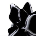
By using an intuitive interface, participants can experiment with Transcom’s four graphic elements and create unique design elements at any time.
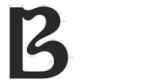
Each letter from the new wordmark is incorporated into Transcom's existing typeface, ensuring that T:LABS stands out and grabs your attention.
Folksam
A Collective Force
Financial Services
Brand Activation, Brand Design, Typeface Development, +4