Arelion
Connecting a brighter future
Project summary
A new name and brand identity for the number one ranked Internet backbone provider in the world. A new design concept inspired by high-performance connectivity runs seamlessly throughout the entire brand experience.
Impact achieved
+48%
Innovative Design Impression
+48%
High-tech Design Impression
+33%
Modern Design Impression
+22%
Design uniqueness
NPS
Record — The best in the industry
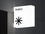
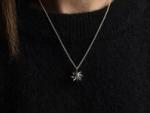
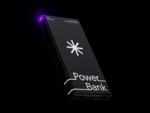
The new symbol, which took its inspiration from a map where network cables meet, reveals a 3-dimensional sphere in motion – a representation of Arelion’s global network and how they connect continents, companies, and people.

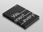
A bespoke typography and typographic layout system were also developed based on the concept of connectivity. Arelion Display connects words and can be used in a variety of contexts to create a sense of unity, connectivity, and flow.
"I am truly impressed by how Bold/NoA managed such a complex rebranding project. In every step of the journey, they brought in top-notch creativity and strategic thinking. Their ability to stay on top of things and move things forward in a smooth way is exceptional. For companies looking to create unique brand experiences, Bold should be a go-to partner."
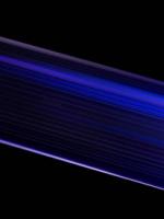
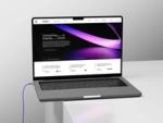
Inspired by Arelion’s fiber cables, where information travels at the speed of light, we created a series of 3D artworks for both static and motion use. These detailed artworks show the intricate networks of fibers running through them and feature light phenomena in Arelion’s primary colors.


The new image style reflects the enlightenment that Arelion provides, and the use of color allows them to take ownership of any content. To further enhance the impact of the image style, we developed an interface that simply allows users to create their own images tailored to their specific needs.
