TeamViewer
Creating a world that works better
On the back of amazing global growth, the TeamViewer brand had become dated and fragmented across branded features, products and services. To consolidate and keep competing in a fiercely competitive space, we helped TeamViewer simplify and streamline not just its master brand but also its approach to applying a master brand to a very complex portfolio of commercial offerings.
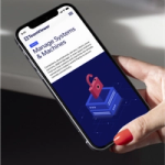
The main creative concept revolved around layers and simplicity as a true analogy to what the core TeamViewer product provides its customers. This idea resulted in a fully updated brand identity, new typeface, new logo, 3D brand assets, a digital asset management system and core assets for digital products.
The identity brings modernity and professionalism to the global brand and moulds a strong master brand core in everything they do. This is how we – with the new identity – bring simplicity to the surface, which was essential to the continued success of TeamViewer.
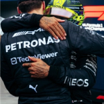
An update to the brand mark and logotype was developed to accommodate for better rendering across a multitude of applications. From digital platforms and apps to large scale reproductions and into partnership applications like F1 and Manchester United, the signature needed to optimally render for maximum visabillity.
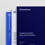
A bespoke typeface where developed in order to accompany the updated visual language. TeamViewer Sans encompasses a modern aesthetic, simple yet distinct characteristics and personality while keeping a trusted and professional base construction.
The typeface was developed in collaboration with Monotype.
Inspired by the multitude of opportunities TeamViewer provides in its software portfolio, an organic graphical asset was developed. It signals ongoing development and positive solution process while adding striking visuals to the brand, clearly placing it in the technology category.