Pontus In The Air
Luxury and humour at Sweden’s largest airport
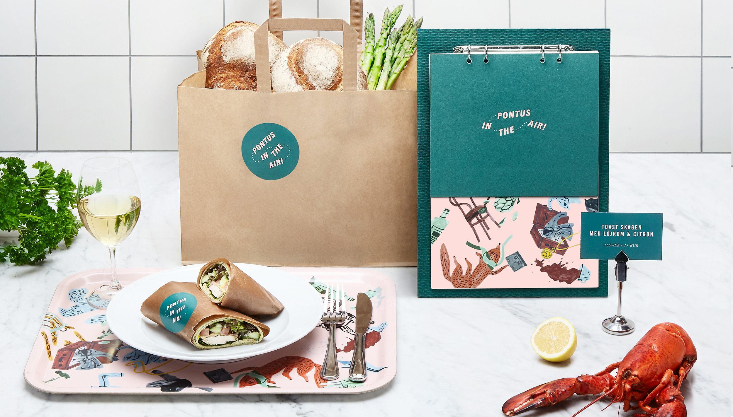
When creating a name and a visual identity for a new restaurant at Arlanda Airport we found inspiration with the founder himself, a colourful and charismatic person, and the movement and energy of the airport itself: a place where anything can happen, and do.
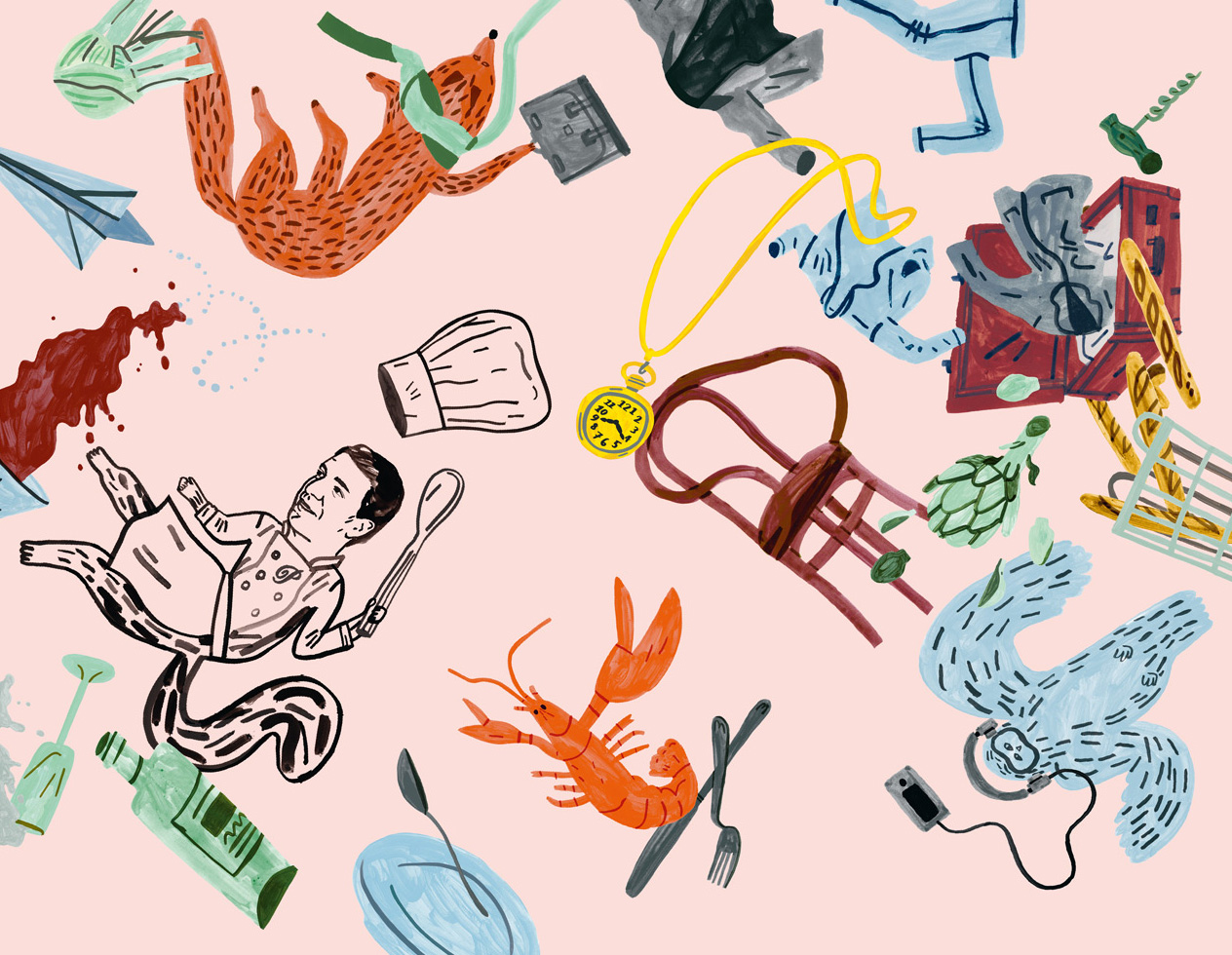
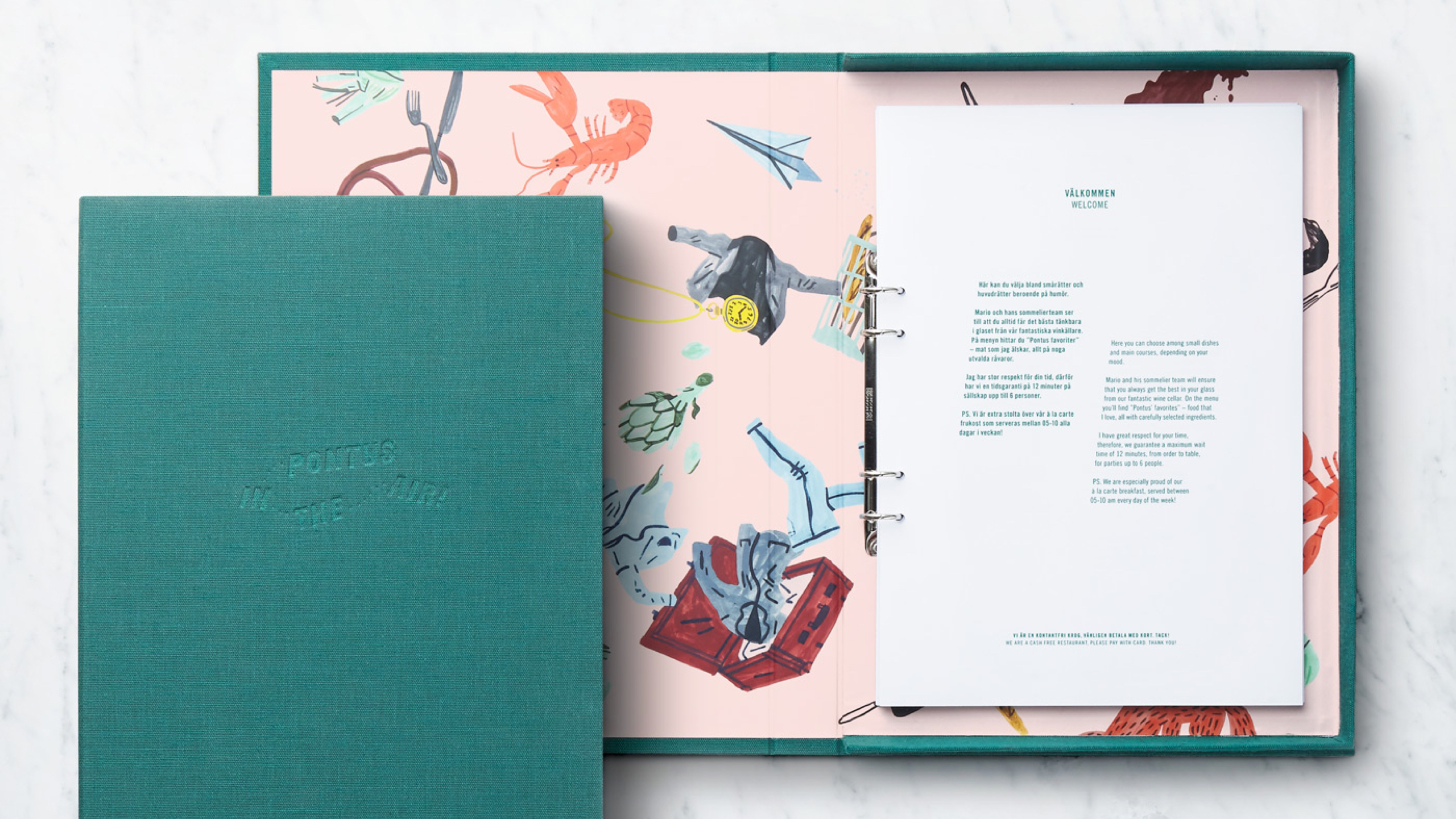
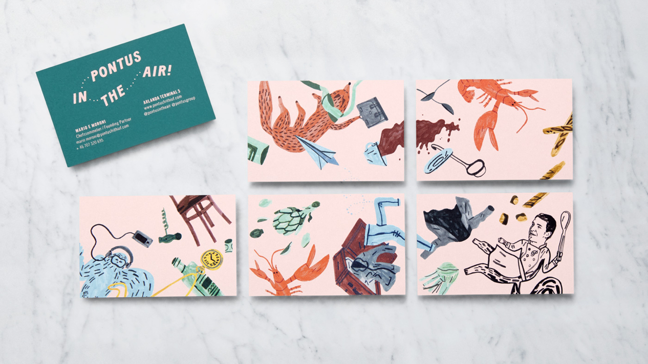
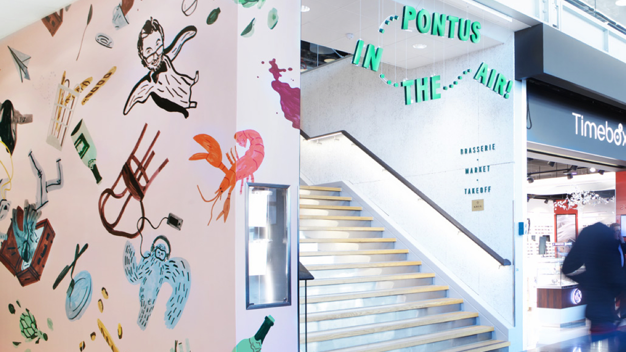
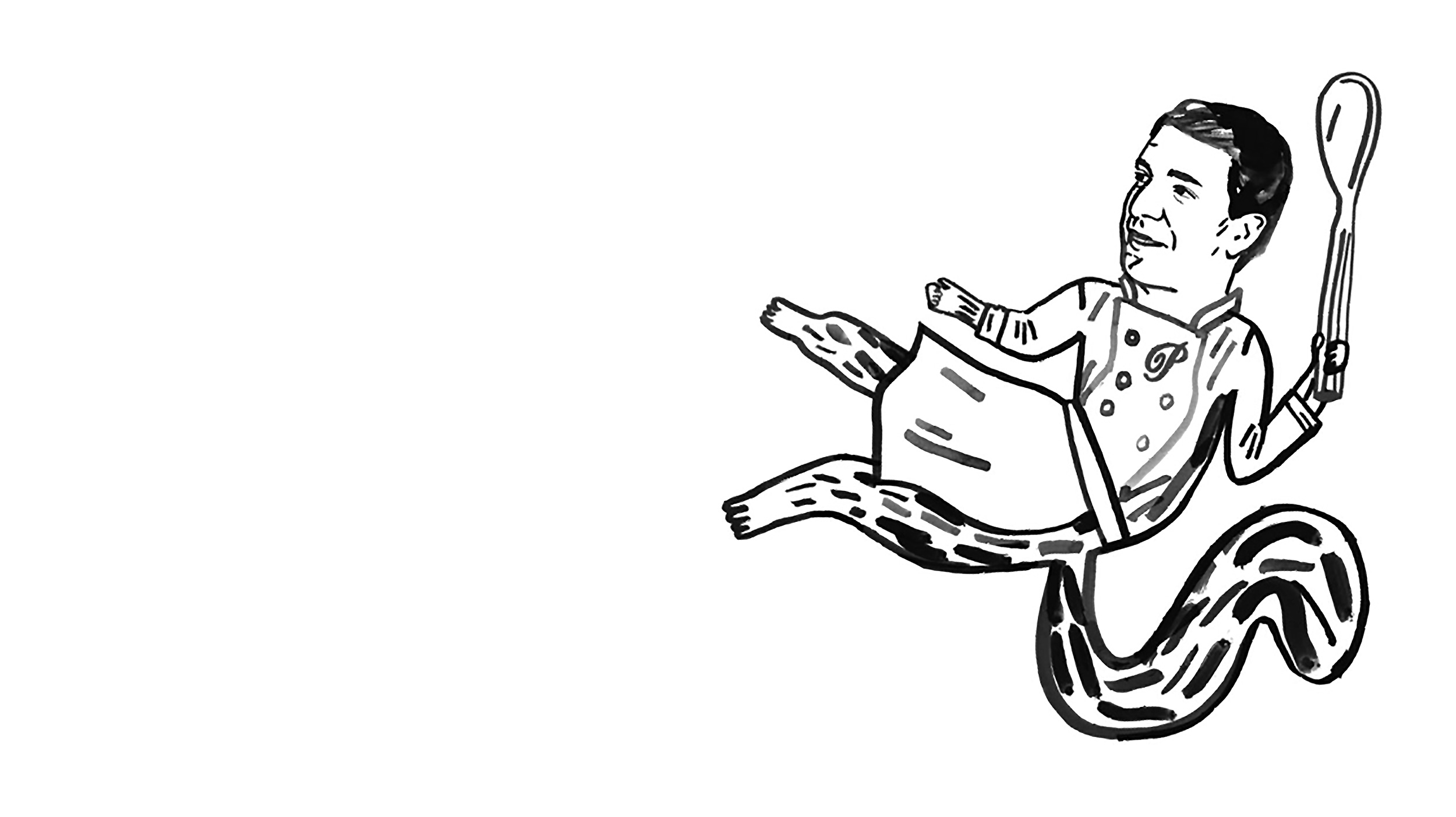
We were inspired firstly by Pontus himself, a colourful and charismatic person and also by the airport, a location with constant movement and energy. We wanted a feeling of luxury but with a touch of humour. We envisioned an elegant dinner where the guests suddenly grabbed the tablecloth and flung everything up in the air. Together with a talented young illustrator we created several hand-drawn illustrations that also create a pattern. Here lobsters, silverware, champagne bottles, animals, random travel paraphernalia and even Pontus himself with his sommelier Mario, is thrown into the air.
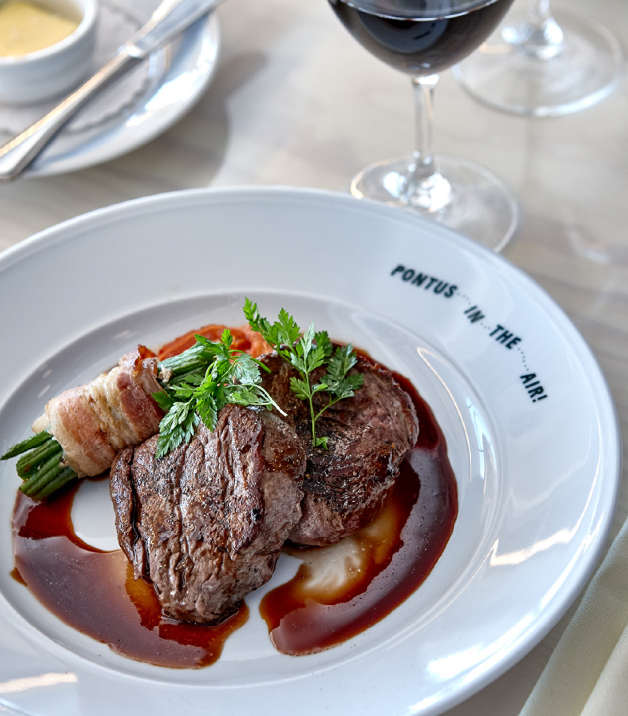
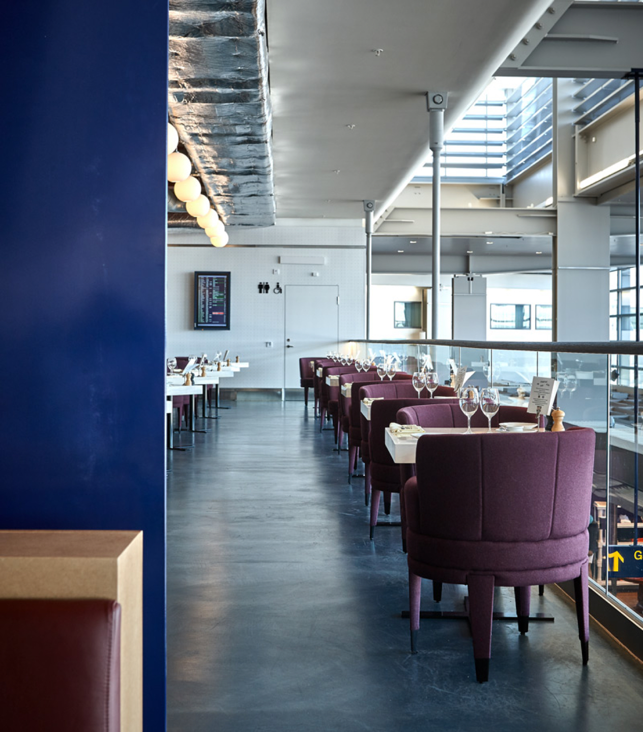
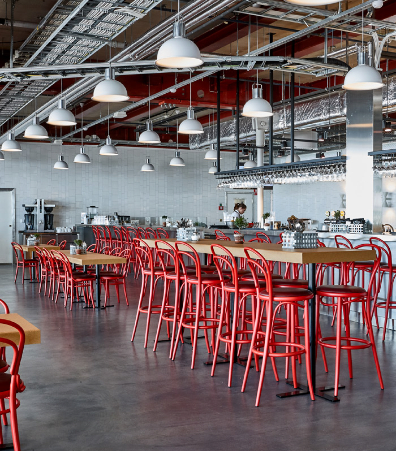
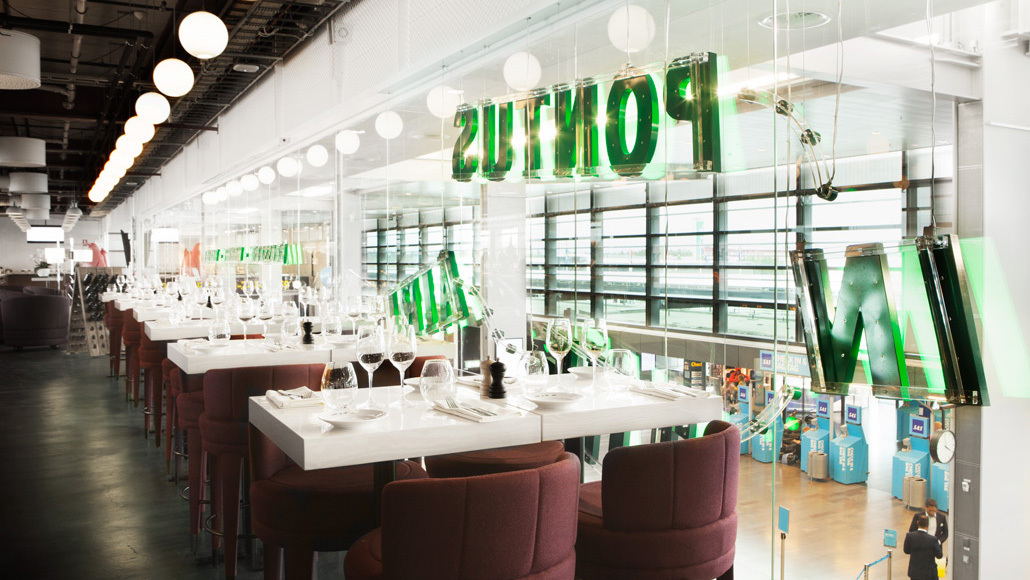
The logotype provides a sense of journey and destination in the linking of words with dotted lines, and the sloping layout of the menus builds in another sense of motion and direction. For the interior of the restaurant where we were inspired by Arlanda Airport’s golden days of the 1960’s. Instead of a traditional press release we created a short launch film that sees illustration replaced by objects thrown up and filmed at high-speed camera. A neat variation on concept that retains many of the same visual qualities.
Instead of a traditional press release we created a short launch film where we threw things in the air and filmed it with a high-speed camera. The film quickly spread on social media.
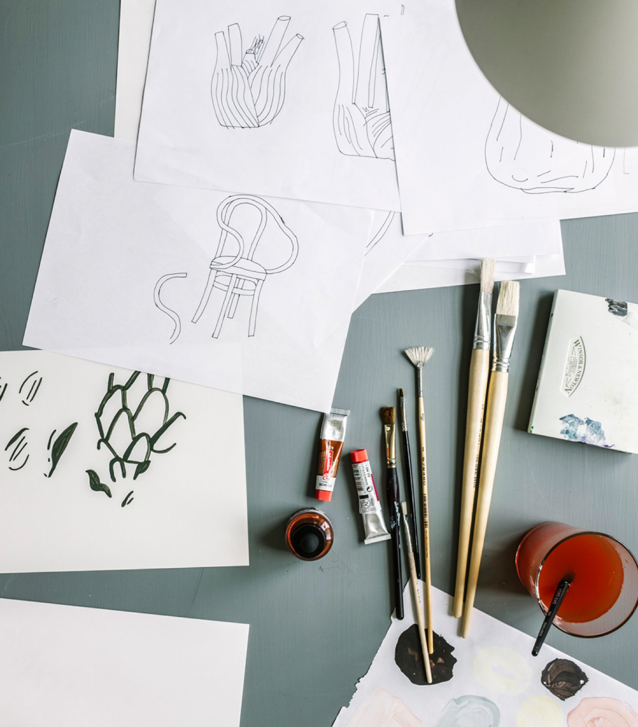
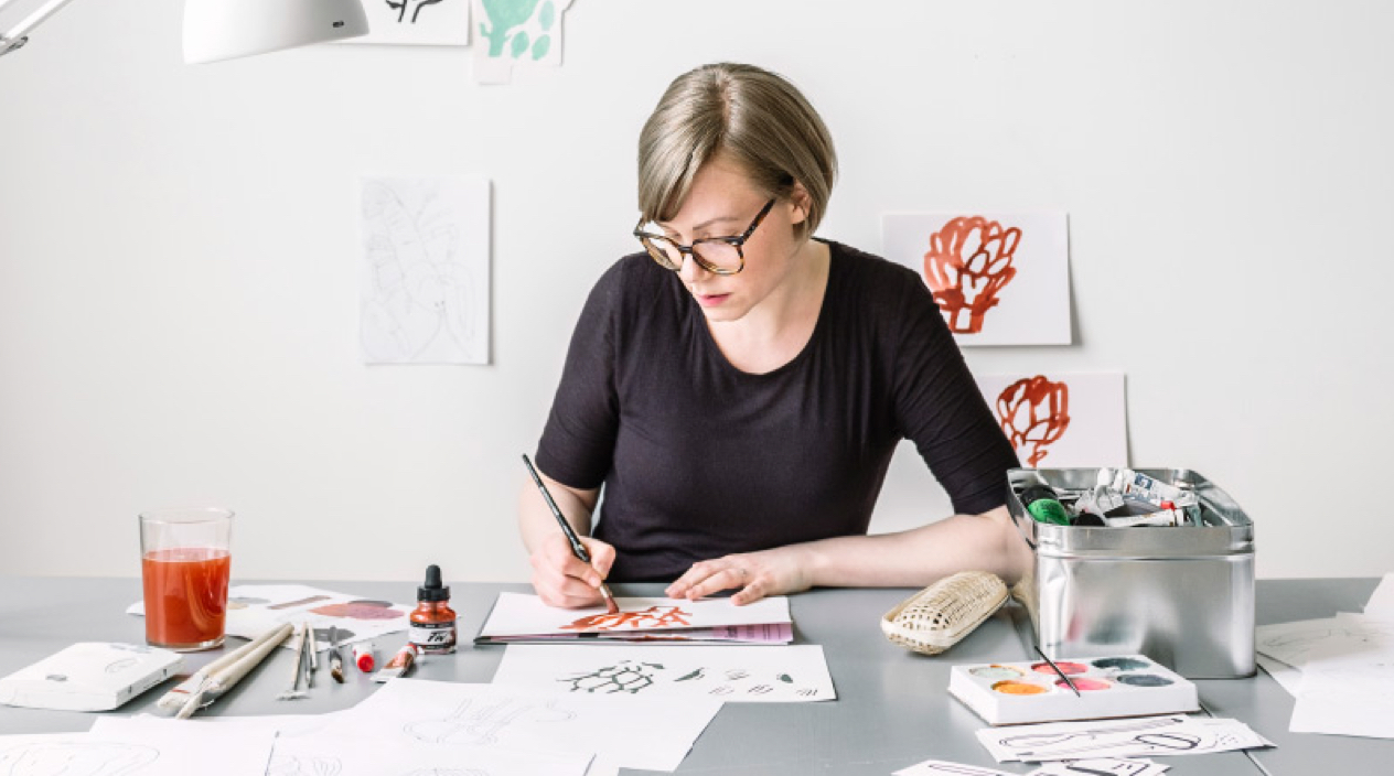
Together with illustrator Klara Persson we created hand-drawn illustrations which became the foundation of the visual identity.
