EuroPride
Loud & Proud
The Pride movement was born in New York City in 1970 celebrating dignity, equal rights, sexual diversity and gender variance. EuroPride is a pan-European international event dedicated to LGBTI pride, hosted by a different European city each year. During the summer of 2018 EuroPride was hosted by Sweden.
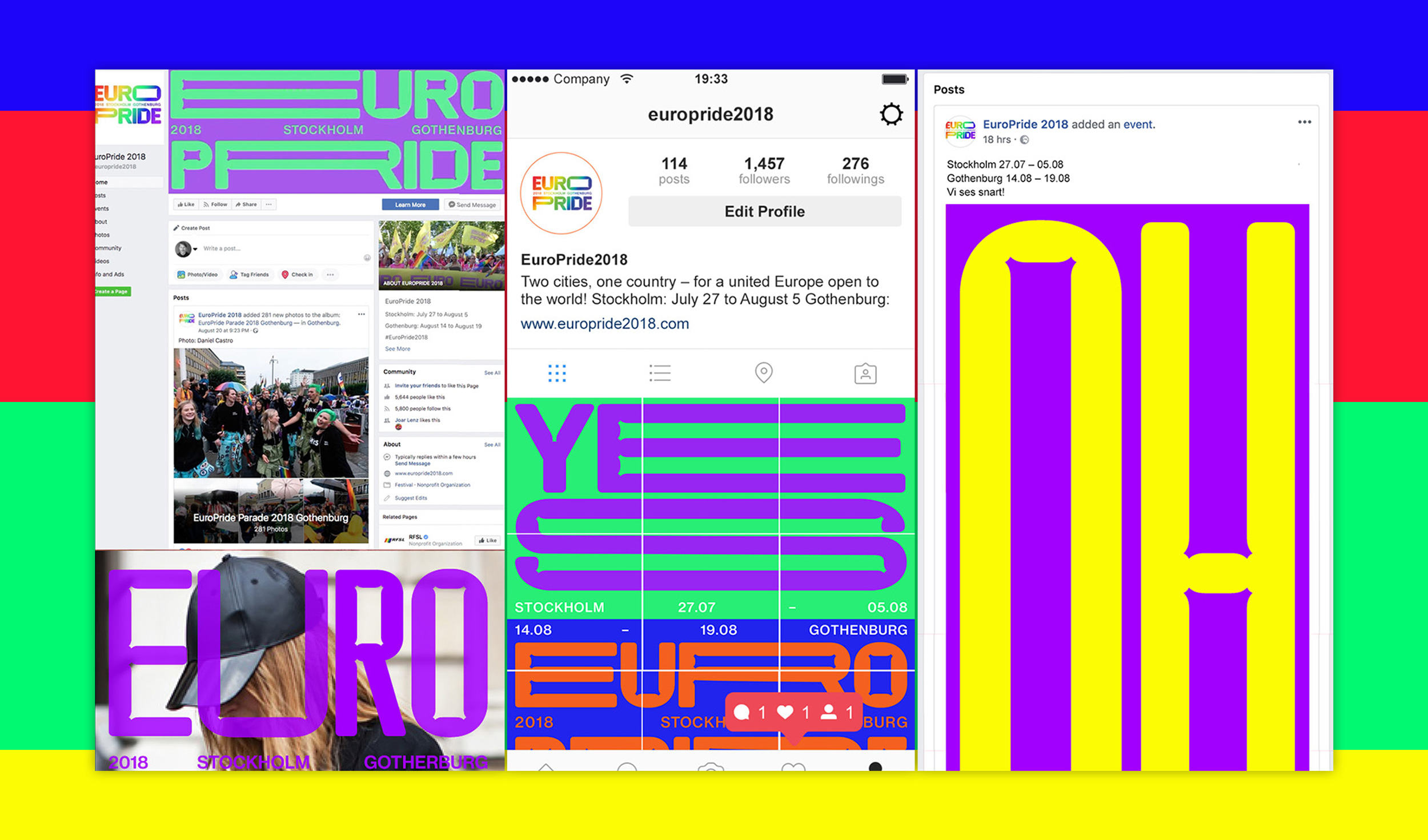
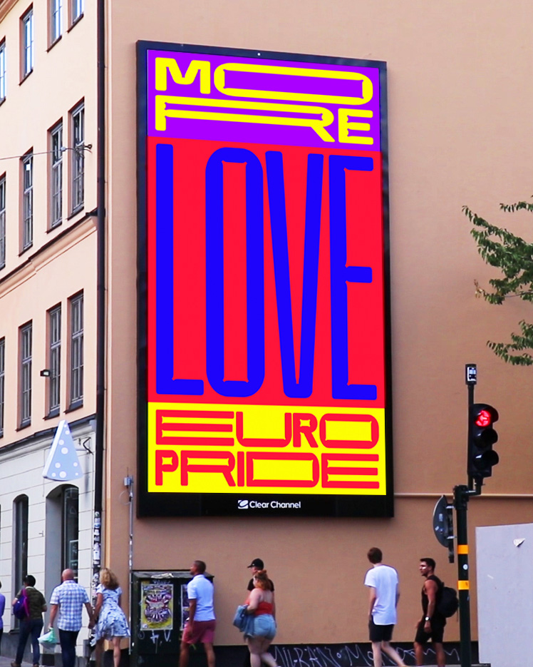
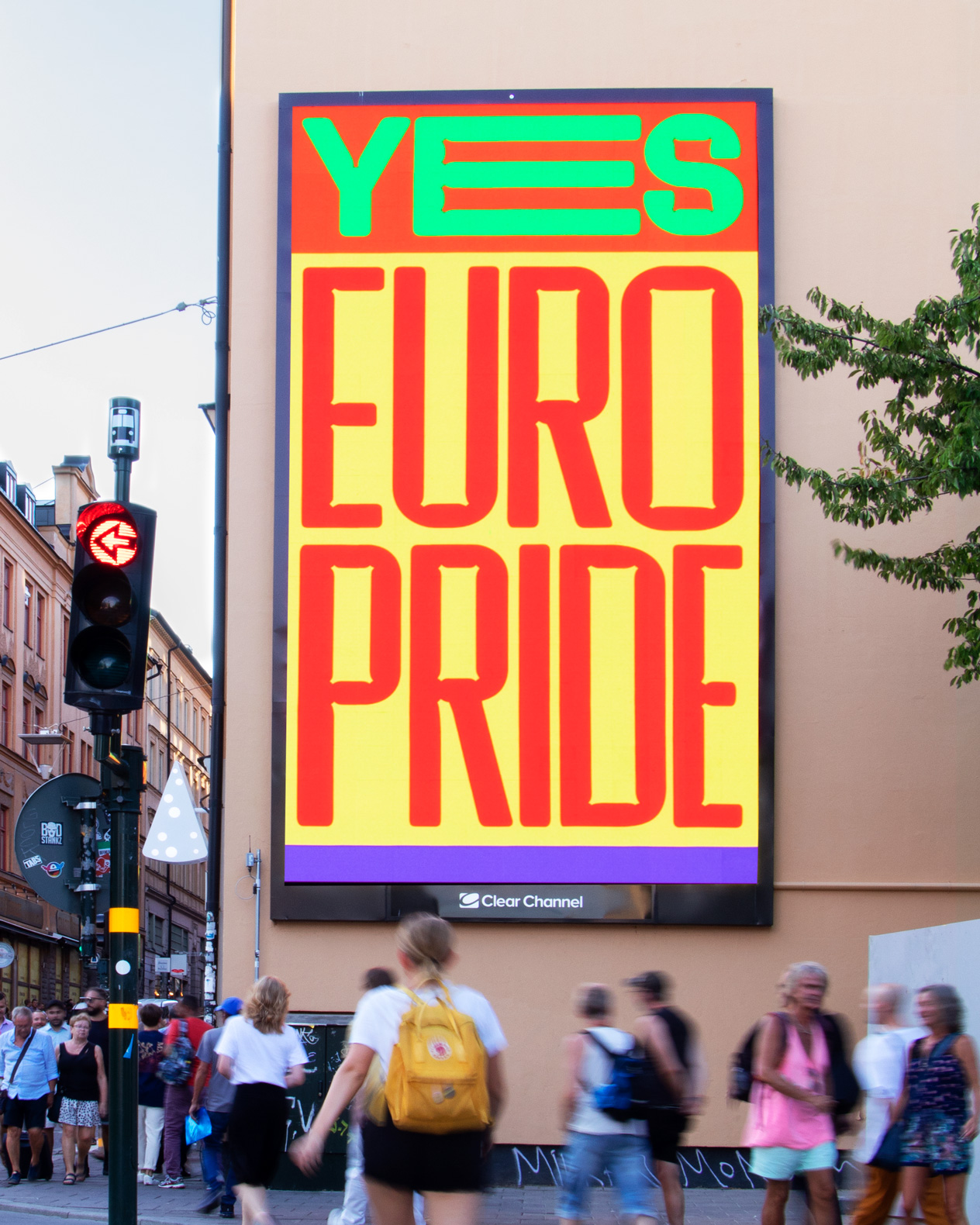
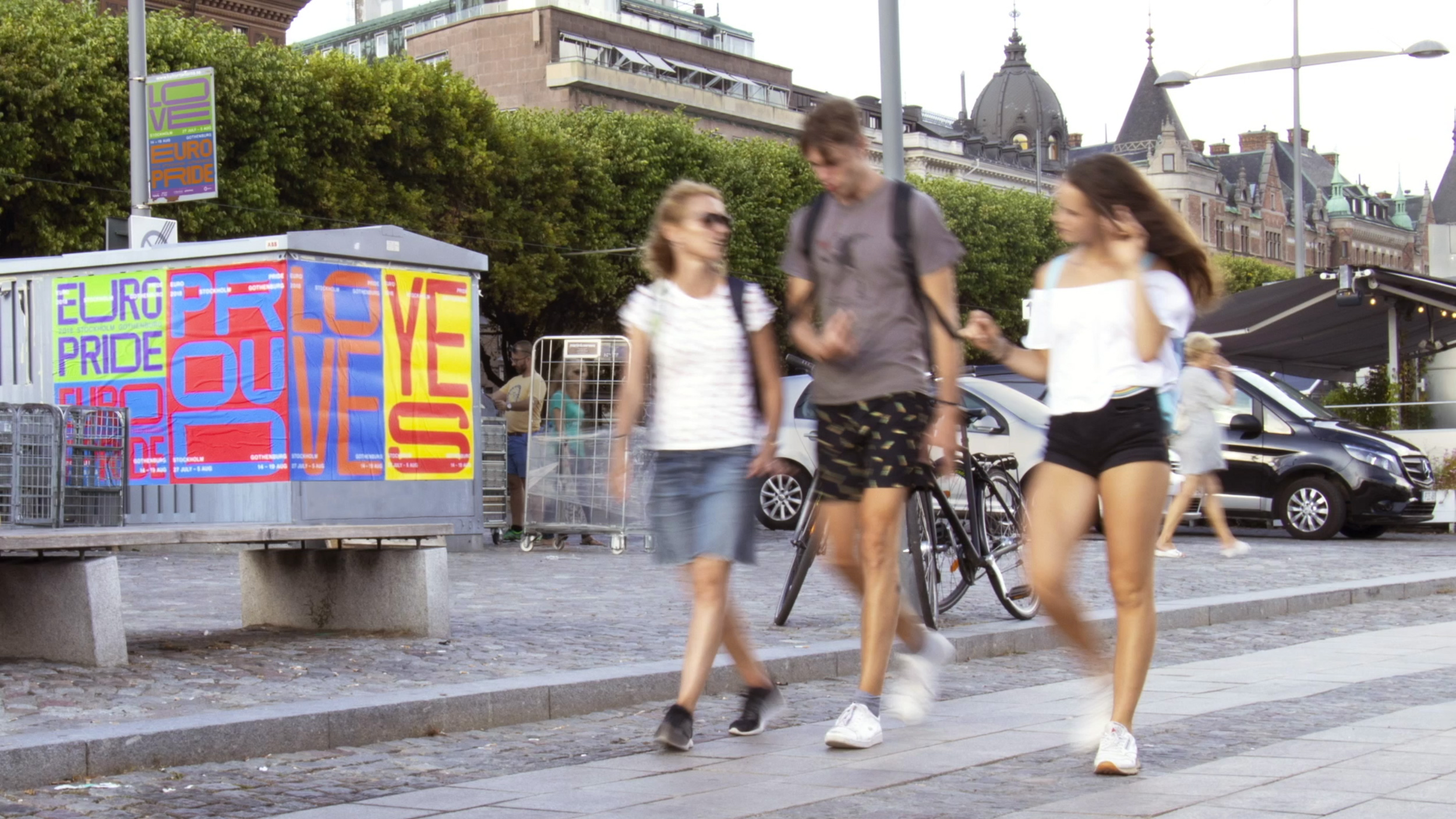
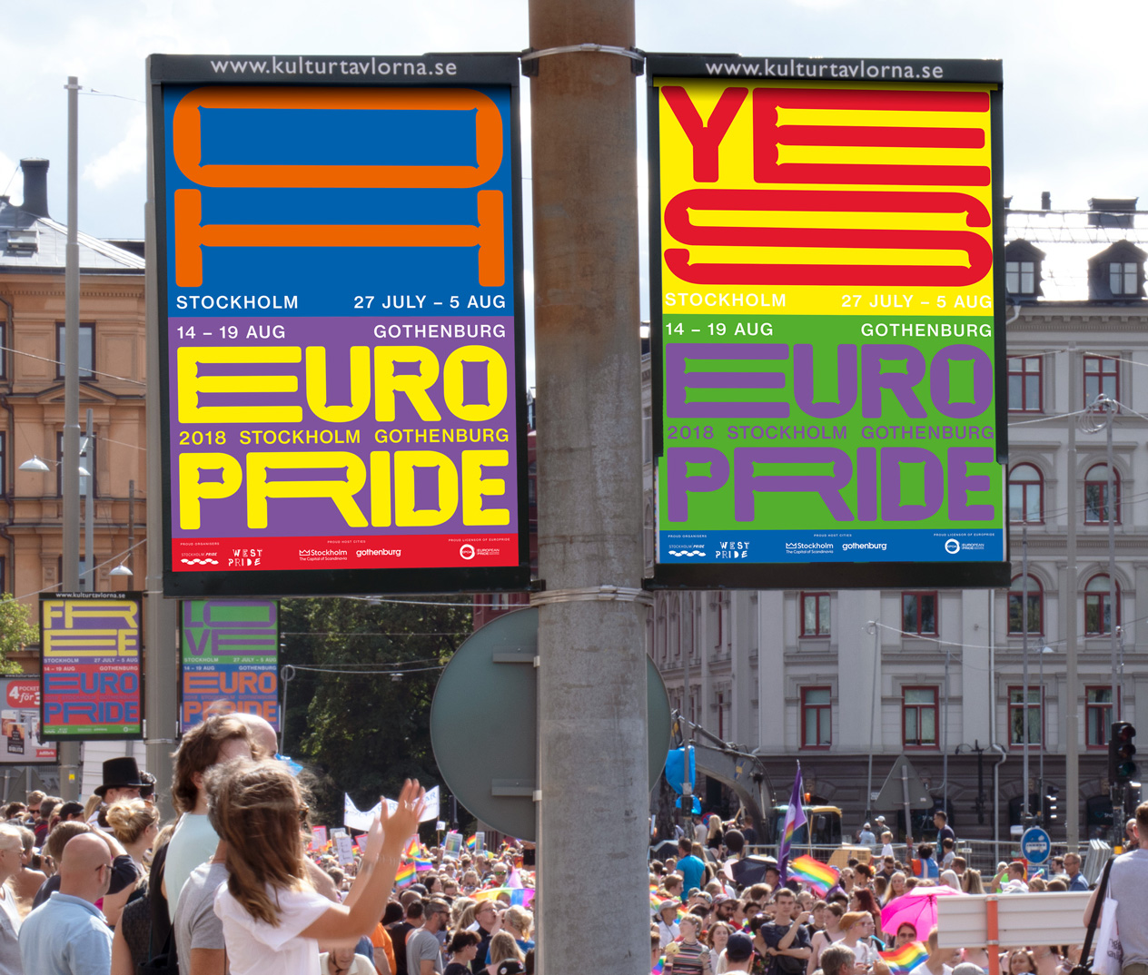
The pride is about being proud. Proud of who you are, what you look like and who you love. The identity for EuroPride 2018 doesn’t stand in the corner – it’s loud and proud. The custommade typeface EuroPride Sans literally fills every surface and owns it by stretching and growing.
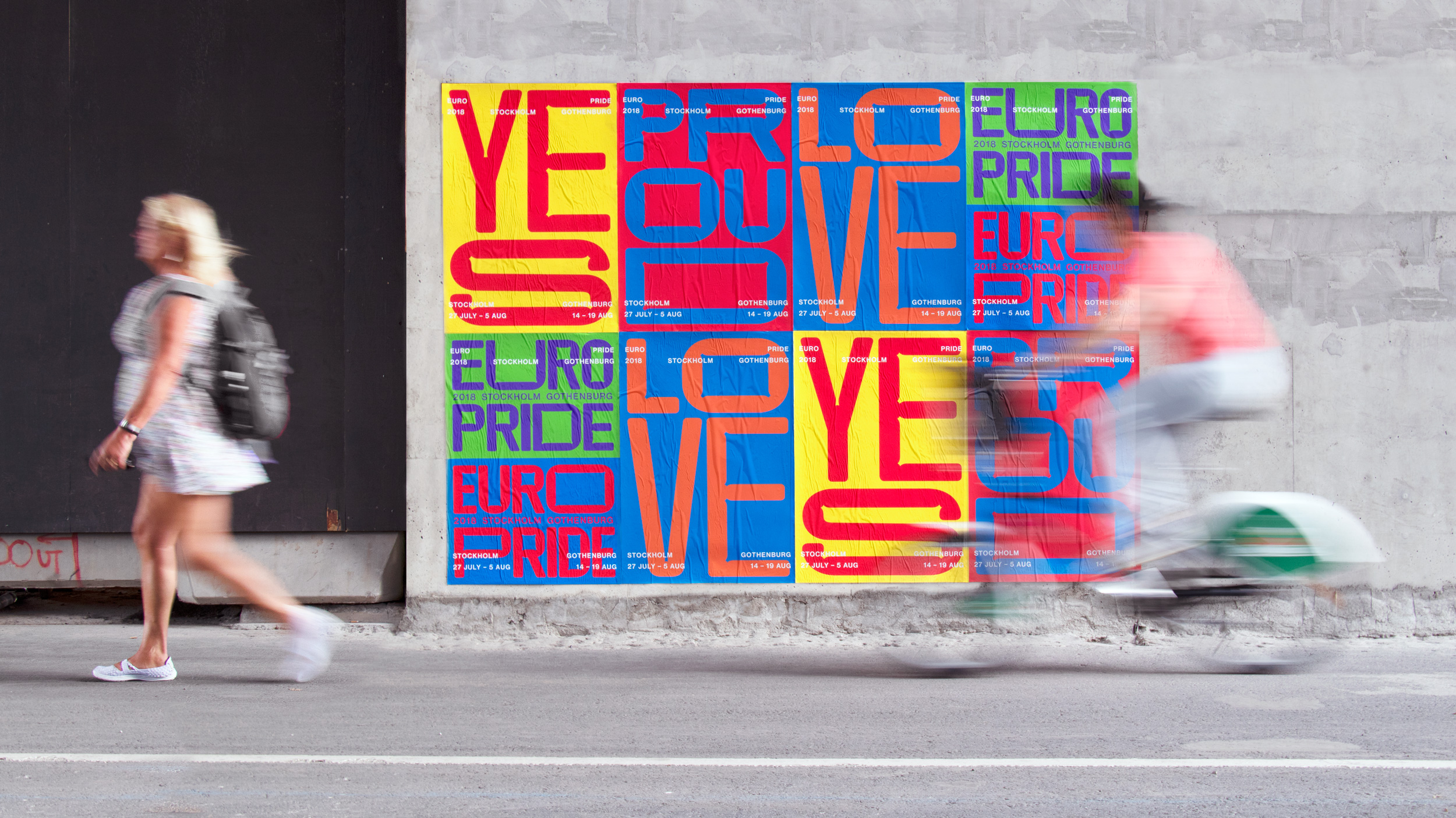
The original spirit of gay pride was political and had an activist character. It started as a riot. The parade was full of signs with simple words with strong messages. We wanted to keep that rebellious feeling by using simple, positive but strong typographic messages.
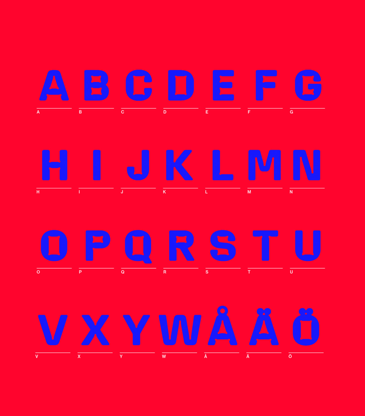
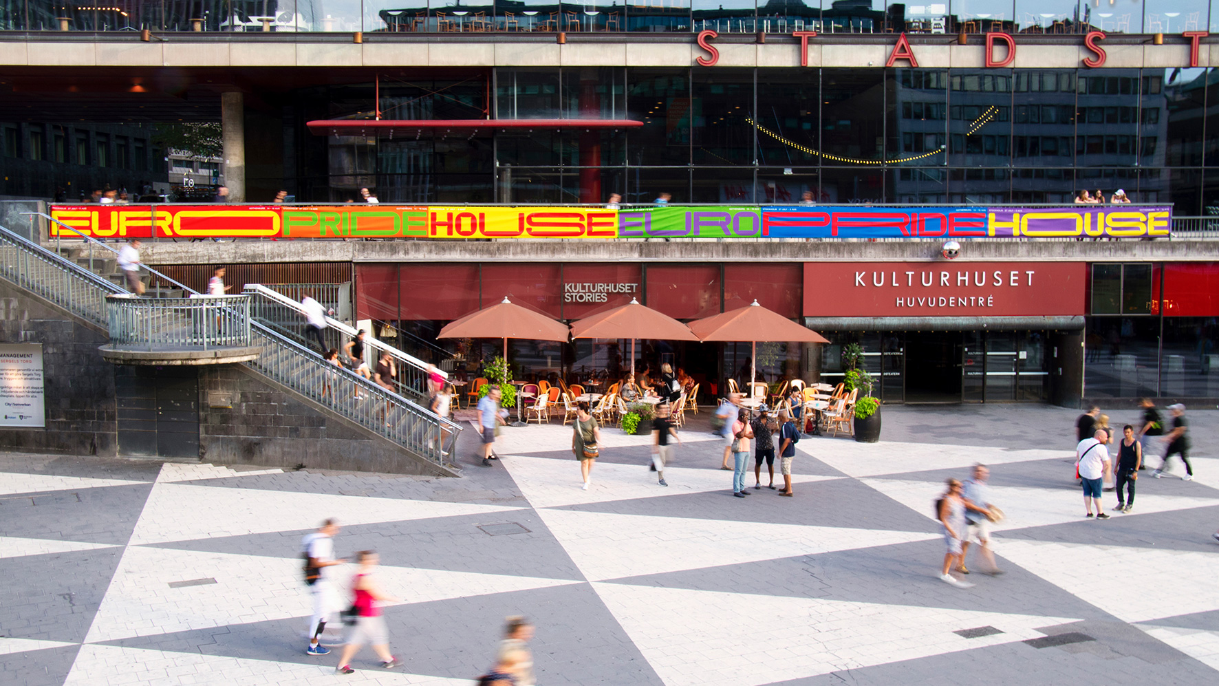
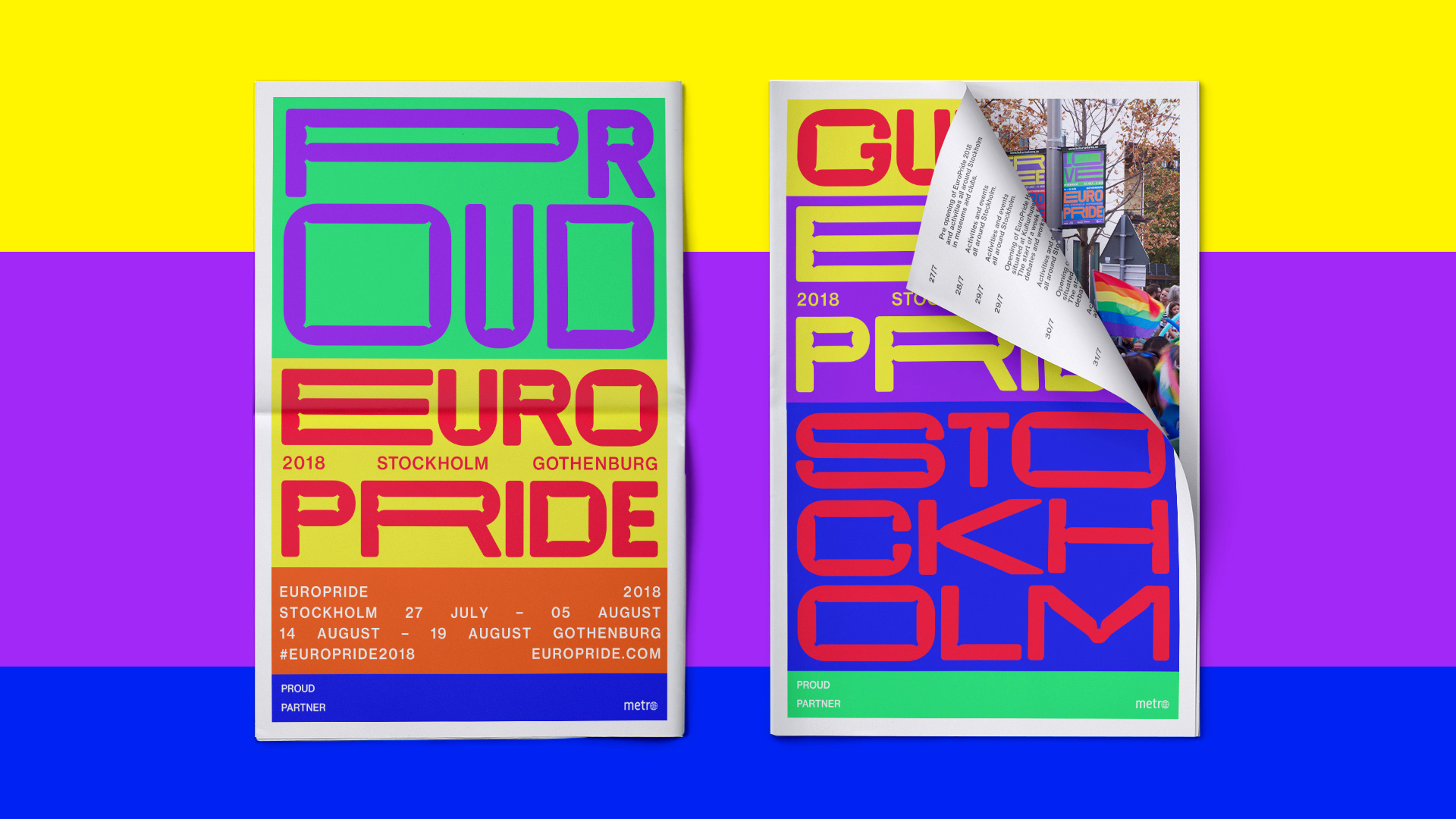
The core element of the identity is the custommade typeface EP Sans. The idea behind the typeface was that it should adapt and react to its environment, stretching from ultra extended to ultra condensed, always filling the available space. It is a variable font that changes depending on format, interaction and viewport width. A typeface that isn’t afraid to be expressive. It’s made to be both unconventional and ugly-cute. Friendly and round with its folds and flabs but at the same time strong and in-your-face, refusing to be silent.
We used the rainbow flag as our layout system, the colors expanding and compressing to hold the typographic messages. The identity appeared all over Stockholm before and during Pride week, on for example static and moving billboards, guerrilla poster campaigns, magazine ads and in social media.
"Pride started us a riot, and it still is. It's about one week for LGBT rights. It's important for everybody to show who they are, to be proud of who they are, and to love whoever they want to love."
